Charts generation. More...
Classes | |
| class | Axis |
Represents an axis of a chart encapsulated by an instance of XYChart. More... | |
| class | BoxChart |
| This class provides tools to create and manage box-and-whisker plots. More... | |
| class | BoxSeriesCollection |
| This class stores data used in a umontreal.ssj.charts.CategoryChart. More... | |
| class | CategoryChart |
| This class provides tools to create charts from data in a simple way. More... | |
| class | ContinuousDistChart |
| This class provides tools to plot the density and the cumulative probability of a continuous probability distribution. More... | |
| class | CustomHistogramDataset |
| A dataset that can be used for creating histograms. More... | |
| class | DiscreteDistIntChart |
| This class provides tools to plot the mass function and the cumulative probability of a discrete probability distribution over the integers. More... | |
| class | EmpiricalChart |
| This class provides additional tools to create and manage empirical plots. More... | |
| class | EmpiricalRenderer |
| A renderer that draws horizontal lines between points and/or draws shapes at each data point to provide an empirical style chart. More... | |
| class | EmpiricalSeriesCollection |
Stores data used in a EmpiricalChart. More... | |
| class | HistogramChart |
| This class provides tools to create and manage histograms. More... | |
| class | HistogramSeriesCollection |
Stores data used in a HistogramChart. More... | |
| class | MultipleDatasetChart |
| Provides tools to plot many datasets on the same chart. More... | |
| class | PlotFormat |
| Provide tools to import and export data set tables to and from Gnuplot, MATLAB and Mathematica compatible formats, or customized format. More... | |
| class | PPPlot |
| This class implements PP-plot (or probability-probability plot) objects that compare two probability distributions. More... | |
| class | QQPlot |
| This class implements QQ-plot (or quantile-quantile plot) objects that compare two probability distributions. More... | |
| class | ScatterChart |
| This class provides tools to create and manage scatter plots. More... | |
| class | SSJCategorySeriesCollection |
Stores data used in a CategoryChart. More... | |
| class | SSJXYSeriesCollection |
Stores data used in a XYChart. More... | |
| class | XYChart |
| This class provides tools to create charts from data in a simple way. More... | |
| class | XYLineChart |
| This class provides tools to create and manage curve plots. More... | |
| class | XYListSeriesCollection |
| This class extends umontreal.ssj.charts.SSJXYSeriesCollection. More... | |
| class | YListChart |
| This class extends the class umontreal.ssj.charts.XYLineChart. More... | |
| class | YListSeriesCollection |
| This class extends umontreal.ssj.charts.XYListSeriesCollection. More... | |
Detailed Description
Charts generation.
This package contains utility classes to produce charts either for LaTeX or to be shown on the computer screen, from a Java program. It is based on the open source JFreeChart software, available at http://www.jfree.org/jfreechart/, and distributed under the terms of the GNU Lesser General Public License (LGPL). It provides tools for the construction, visualization, and customization of XY plots, histograms, and empirical styled charts. It offers facilities to export charts to PGF/TikZ source code, which can be included into LaTeX documents. TikZ is a free LaTeX package to produce pictures such as plots, and can be downloaded from http://sourceforge.net/projects/pgf.
The user does not need to be familiar with the JFreeChart package or the TikZ syntax to use these tools, except if customization is required. For this, one may see the API specification of JFreeChart, and the reference manual of TikZ.
The two basic abstract classes of package charts are XYChart and CategoryChart. All other charts inherit from one of these two. Charts are managed by the mother class which contains the data tables in a SeriesCollection object, and the information about \(x\)-axis and \(y\)-axis in Axis instances. All these objects encapsulate JFreeChart instances along with some additional TikZ-specific attributes. The method XYChart.view displays charts on screen while the method toLatex formats and returns a String which contains the TikZ source code that can be written to a LaTeX file.
Several chart styles are available and each one is represented by a subclass of XYChart or of CategoryChart. The XYLineChart uses XYListSeriesCollection to plot curves and lines, the HistogramSeriesCollection class is used by HistogramChart to plot histograms, and the EmpiricalSeriesCollection is used by EmpiricalChart to plot empirical style charts. It is possible to draw a scatter plot or a box plot using ScatterChart or BoxChart respectively. These concrete subclasses have similar APIs, but they are specialized for different kinds of charts.
These charts can be customized using *SeriesCollection subclasses and Axis. First, one can use methods in the XYChart class for setting the range values and a background grid. One can also use the method getSeriesCollection() for subclasses of charts to obtain the dataset of the chart, which is represented by a *SeriesCollection object. This dataset can be customized in the following ways by calling methods on the series collection: selecting color, changing plot style (straight lines, curves, marks only, etc.), putting marks on points, setting a label and selecting the dash pattern (solid, dotted, dashed, …). The available properties depend on the type of chart. Moreover, objects representing the axes can be retrieved with XYChart.getXAxis for the \(x\)-axis, and XYChart.getYAxis for the \(y\)-axis. By using methods in Axis, many customizations are possible: setting a label to the axis, setting ticks labels and values (auto ticks, periodical ticks or manually defined ticks) and changing the twin axis position on the current axis to select where axes must appear. These settings are independent for each axis.
Each chart object from SSJ encapsulates a JFreeChart object: a XYChart instance contains a JFreeChart instance from JFreeChart API, a *SeriesCollection contains a XYDataset and a XYItemRenderer, and finally an Axis contains a NumberAxis. So any parameter proposed by JFreeChart is reachable through getter methods. However, changing the JFreeChart parameters directly may have no impact on the produced TikZ source code.
The two special classes ContinuousDistChart and DiscreteDistIntChart can be used to plot probability densities, mass functions, and cumulative probabilities for continuous or discrete distributions, which are implemented in package umontreal.ssj.probdist of SSJ.
The package charts provides additional tools for formatting data plot, and creating charts with multiple datasets. The PlotFormat class offers basic tools to import and export data from files. Supported file formats are GNUPlot and standard CSV, which is widely used and accepted by most mathematical softwares such as MATLAB and Mathematica. Customizing file input and output format is also possible. Finally MultipleDatasetChart provides tools to plot with different styles on the same chart.
Examples
For a series of examples, see the pdf documentation.
The following examples demonstrate how to build charts with this package.
A simple example of chart creation [normalchart]
The first program, displayed in Listing normalchart, shows the simplest way to export charts from data tables. First, a curve is defined with regularly spaced \(x\)-coordinates in method getPoints; it represents the curve \(y = e^{-x^2/2}/\sqrt{2\pi}\), the density of the standard normal probability distribution. Arrays points[0] contain the \(x\)-coordinates and points[1] the \(y\)-coordinates of the points. Figure normalchart-res presents the resulting chart if the produced TikZ code is added to a LaTeX document using the tikz package, and compiled using LaTeX or PdfLaTeX.
A simpler way to plot a probability density or a distribution function is to use the class umontreal.ssj.charts.ContinuousDistChart, as shown in Listing normaldist where however, the normal density will be plotted directly on the screen.
The normal density [normaldist]
The next example, displayed in Listing poissonchart, plots the probability mass function for a Poisson distribution with \(\lambda= 50\) by simply creating an instance of umontreal.ssj.charts.DiscreteDistIntChart. Figure poissonchart-res presents the resulting chart obtained from PdfLaTeX.
Probabilities of the Poisson distribution [poissonchart]
The next program, displayed in Listing simplechart, shows how to export several charts from data tables. First, three curves are defined with regularly spaced \(x\)-coordinates in methods getPoints*; they represent the curves \(y = \sqrt{x}\), \(y = \cos(x)\) and \(y = x+2\), respectively. Array points[0] contains the \(x\)-coordinates and points[1] the \(y\)-coordinates of the points. Figure simplechart-res presents the resulting chart if the produced TikZ code is added to a LaTeX document using the tikz package, and compiled using LaTeX or PdfLaTeX.
Three curves on the same chart [simplechart]
The next example, given in Listing customchart, shows how to customize a chart. First, three curves are defined as in example simplechart above and the chart is created. Then the axes are customized by adding labels at chosen values on the \(x\)-axis. On the \(y\)-axis, successive labels are set regularly at points 1 unit apart. Then the data plot itself is customized. A new color is created in the RGB model for the first curve which also receives a label name and a dash plot style. Similarly, the other two curves receive their label name, plot style and color. Note that the third curve is drawn in the ORANGE color predefined in the AWT package of the standard Java toolkit. Finally, the charts are exported to a file in LaTeX format. If the file is compiled with LaTeX or PdfLaTeX, the resulting chart will appear as displayed in Figure customchart-res.
Code for creating and customizing a chart [customchart]
The next example, given in Listing empiricalchart, shows how to plot and customize empirical distributions. First, two empirical distributions are defined from a sample of points obtained from a uniform generator and a Beta \((3, 1)\) generator, both on the interval \([0, 1]\). Then an empirical chart is created to plot these two distributions. The first distribution is plotted in MAGENTA color with filled square marks from TikZ. The second distribution uses default color and plot marks. A background grid is also added with cells of size \(0.1\times0.1\). Finally, the charts are exported to a file in LaTeX format. Figure empiricalchart-res shows the resulting chart.
Creating and customizing empirical distribution charts [empiricalchart]
The next example, given in Listing histo1, shows how to plot a simple histogram. First, data is generated from a standard normal. Then the plot is customized: 80 bins are selected, and the range of the plot is set manually with bounds; the interval is \([-4, 4]\) for the \(x\)-coordinates, and \([0, 5000]\) for the \(y\)-coordinates. Finally, the histogram chart is viewed on the screen, then exported to file HistogramTest1.tex in LaTeX format. Figure histo1-res displays the resulting chart.
Source code creating a simple histogram [histo1]
The next example, given in Listing histochart, shows how to plot and customize histograms. First, the two histogram charts data1 and data2 are created. Then the data plots are customized: two colors are selected in the sRGB model from the java.awt.Color package. 40 bins are selected on the interval \([-6, 6]\) for the first histogram. The number of bins for the second histogram is set automatically. The range of the plot is set manually with bounds. Finally, the two histograms charts are exported to file HistogramChartTest.tex in LaTeX format. Figure histochart-res displays the resulting chart.
Source code creating and customizing histograms. [histochart]
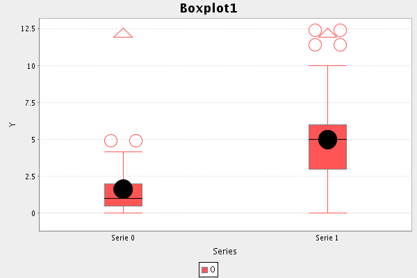
The next example, given in Listing boxplot, shows how to create a box-and-whisker plot. First, two series of 1000 points are obtained from a lognormal distribution and from a Poisson distribution with \(\lambda=5\). These are passed to a BoxChart object, which creates the boxplot, which can be viewed on screen by executing the program. We find that the boxplot for the Poisson data (the box on the right of the chart) has median = 5 (the line inside the box), a mean = 5.009 (the center of the black circle) the first and the third quartiles at 3 and 6, while the lower and upper whiskers are at 0 and 10. Finally, there are outliers at 11 and 12 (the hollow circles) and extreme outliers (the triangle) at 13, outside the chart. We see that the Poisson data is skewed towards higher values. A similar description applies to the lognormal data (the box on the left of the chart), which is strongly skewed towards smaller values.
Source code creating a box-and-whisker plot. [boxplot]